Frontline operations
I designed an enterprise operations product and the system to build it
A frontline worker rarely opens software before the workday begins. They open it while a job is underway, another is approaching, or a problem needs attention.
The product therefore begins with the work already in progress. It shows the current task first, brings risks into the navigation, and keeps the relevant people, equipment, instructions, and workflows nearby.
I also designed the component system behind the product. Both are available to inspect.
- 1Running product
- 11Component families
- 69Documented component states
- 6Token references
Counts reflect the current published build.
The home screen begins with the current shift
A worker opening the product needs to regain context before choosing where to go. The home screen therefore answers four questions immediately:
- What am I doing now?
- What comes next?
- How much time remains?
- Is anything blocking the work?
The example shift contains three scheduled jobs. One is underway, five and a half hours remain in the shift, and one certification issue could affect the schedule.
Because the current job requires the next action, it receives the most space. The card shows the site, start time, equipment, model, workflow, current step, estimated duration, and elapsed time. From the same card, the worker can continue, request help, or open more context.
Upcoming jobs contain enough information for preparation, but they remain visually secondary. This keeps future work visible without allowing it to compete with the task that needs attention now.
The resulting hierarchy follows the sequence of the workday: now, next, and anything that could prevent either one.
Navigation shows where attention is needed
The home screen helps a worker understand the shift. Once they move through the product, the navigation must preserve that awareness.
A conventional sidebar only shows where features live. This sidebar also shows what has changed inside them:
- PlanningLindgren’s certification expires tomorrow
- FormsSafety step skipped on job 4042
- JobsRework flagged on job 4021
- SessionsLindgren and Reeves need guidance
- AssetsOne asset is down at Meridian
- AssetsRework increased 40% this week
These summaries let a worker decide where to go before opening each section. Navigation therefore acts as both a map and an exception queue.
Status has a shape
Operational status appears in compact places such as the sidebar, job identifiers, headers, and tables. Colour alone would become hard to distinguish in small elements and could disappear in greyscale.
I therefore gave each primary state a shape:
- Blocked
- At risk
- On track
The shape follows an item through the interface, so its status remains recognizable across different screens. Colour can then add emphasis without carrying the meaning by itself.
Equipment connects the object to the work
A worker rarely needs an equipment record only to identify the equipment. They usually need the record to prepare for work or recover from a problem.
The equipment card therefore connects each asset to four kinds of information:
- IdentityMake, model, and year
- PeopleWho knows, uses, or owns it
- ResourcesManuals, specifications, and safety information
- WorkflowsThe procedures that act on it
Together, these relationships support a complete action. A technician can confirm the equipment, find the correct document, identify someone who can help, and open the procedure needed to continue.
The amount of available information varies by asset. One record may contain two people, two resources, and one workflow. Another may contain one person, no resources, and nine workflows.
The component must remain understandable in both cases. Its hierarchy therefore stays fixed while each section expands, contracts, or disappears according to the available content.
- Many workflowsEquipmentCard · Storybook
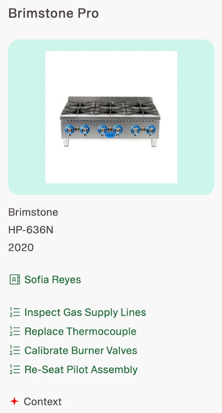 The card expands to support a larger procedure set without changing the information hierarchy.
 - No imageEquipmentCard · Storybook
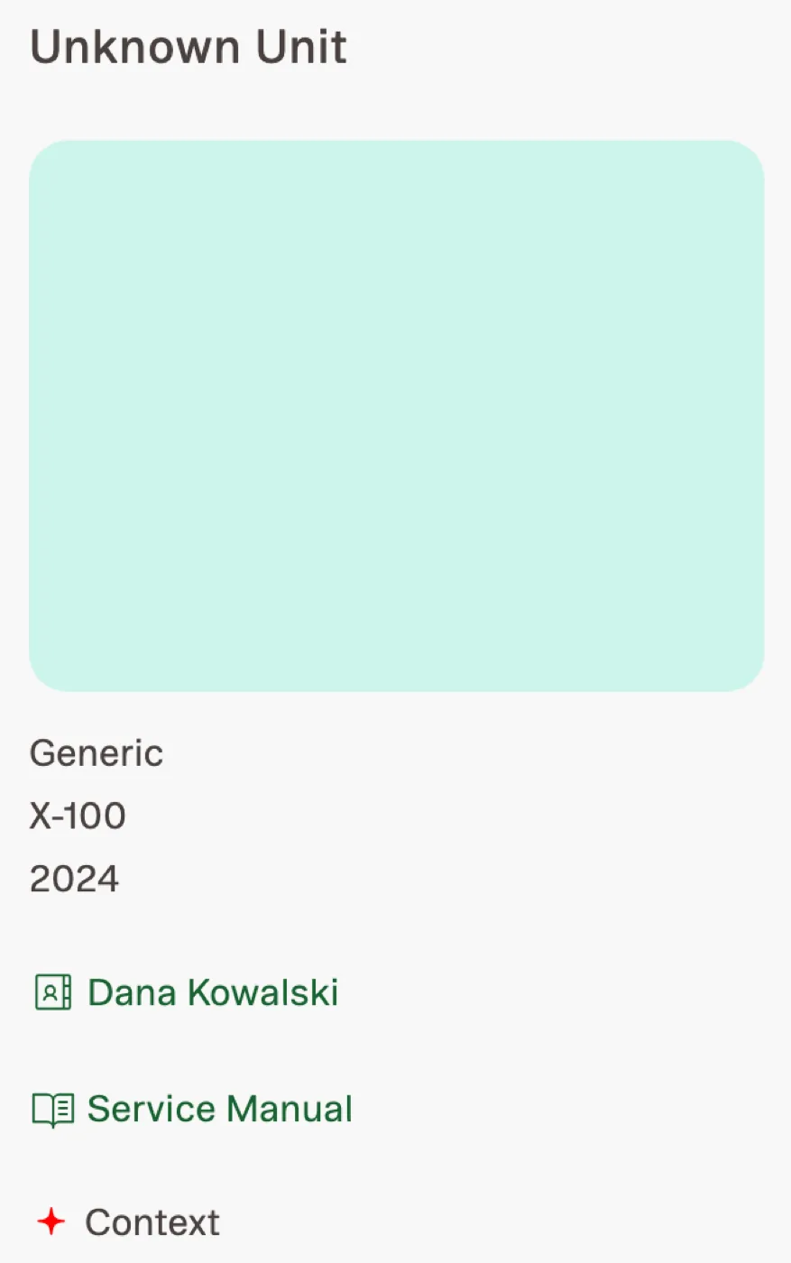 Removing imagery does not remove the equipment identity or its operational relationships.
 - Certification attachedJobCard · Storybook
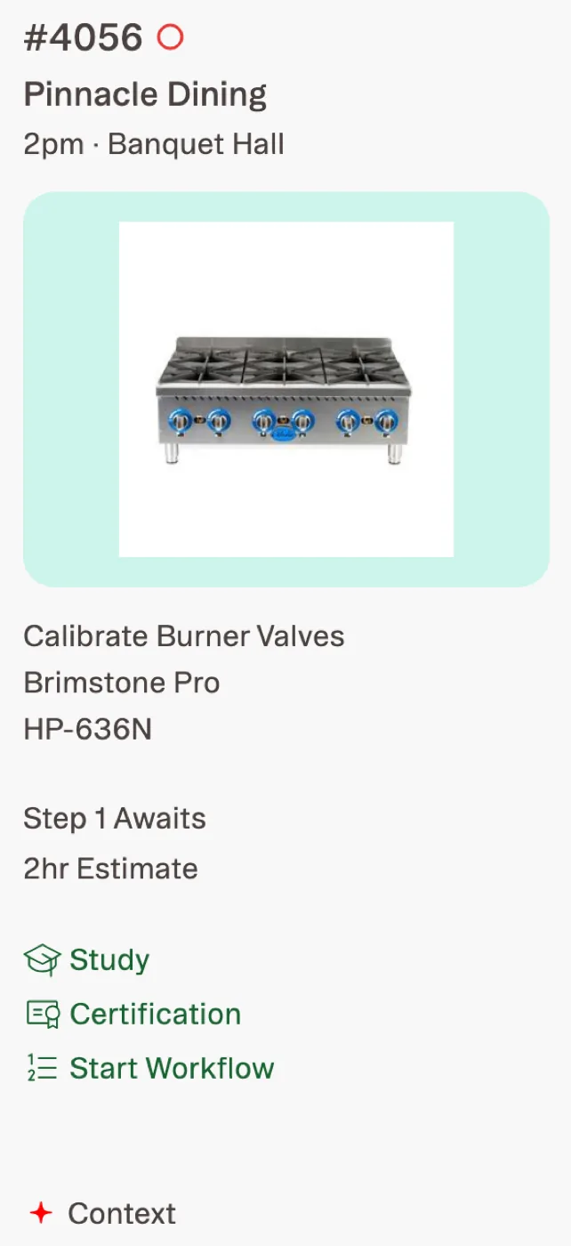 Certification appears beside the job it affects rather than in a disconnected administrative area.
Training appears in the form workers need
When a worker needs help with a job, the useful answer may be a procedure, a reference document, or a person. A conventional course catalogue would hide those options behind a format that does not match the immediate need.
The Training surface instead divides guidance into three columns:
- Digital workflowsProcedures to follow
- ResourcesMaterial to consult
- PeopleSomeone who can help
Tabs separate Welcome, Job Aids, SOP, and Onboarding material. Within each tab, workers can sort items alphabetically or filter for recent and unread content.
The layout must also survive uneven content. One category may be empty while another contains many items. Procedure names may occupy one line or several.
The component library documents these states so implementation does not depend on an idealized amount of content.
- EmptyTrainingColumn · Storybook
 An empty category preserves the column structure instead of collapsing the page unexpectedly.
 - Many itemsTrainingColumn · Storybook
 The component supports a long working list without changing its reading order.
 - Long namesTrainingColumn · Storybook
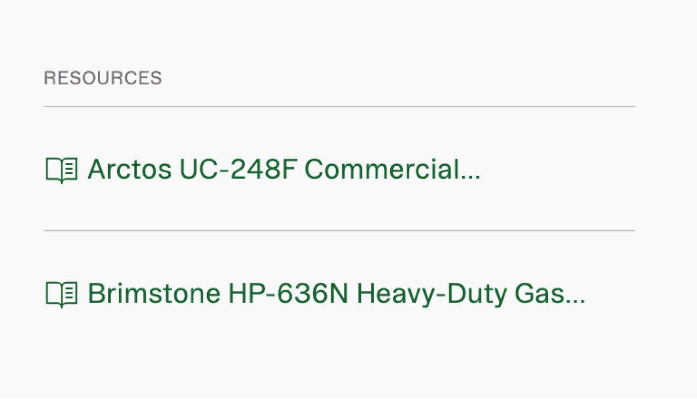 Long procedure and resource names are treated as expected content, not an edge case left to implementation.
The component library documents real variation
The published Storybook contains 69 stories across 11 component families, along with six token references.
The total matters less than the conditions those stories cover. The library includes:
- active, inactive, and unselected navigation
- current and upcoming jobs
- certifications attached to work
- equipment with many workflows
- equipment without imagery
- present and missing resources
- empty content groups
- long names
- alternate border treatments
- five theme palettes
These states come from the ways the product’s content actually changes. Documenting them gives implementation a defined response to each condition instead of leaving those decisions to individual screens.
The component families are organized by their role in the product:
- NavigationSidebar · PageHeader · SubTabBar
- WorkJobCard · EquipmentCard · PartCard
- GuidanceTrainingColumn · IconLinkSection · IconLink
- System controlsPaletteModal · ContextSparkle
Themes vary without changing meaning
The product supports five visual palettes. If each component defined its own theme values, those palettes could change the hierarchy or introduce inconsistent colours.
The token model prevents that by separating fixed values from variable ones.
- Base systemTypography · spacing · radii · borders · shadows
- Stable coloursText · page · surface · status · dividers
- Theme valuesNavigation · image background · highlight · accent · links
- PalettesDefault · Warm · Earth · Slate · Dusk
Every palette changes the same five semantic roles. The interface can therefore change character without changing the meaning of its states or the hierarchy of its content.
- Warm selectedPaletteModal · Storybook
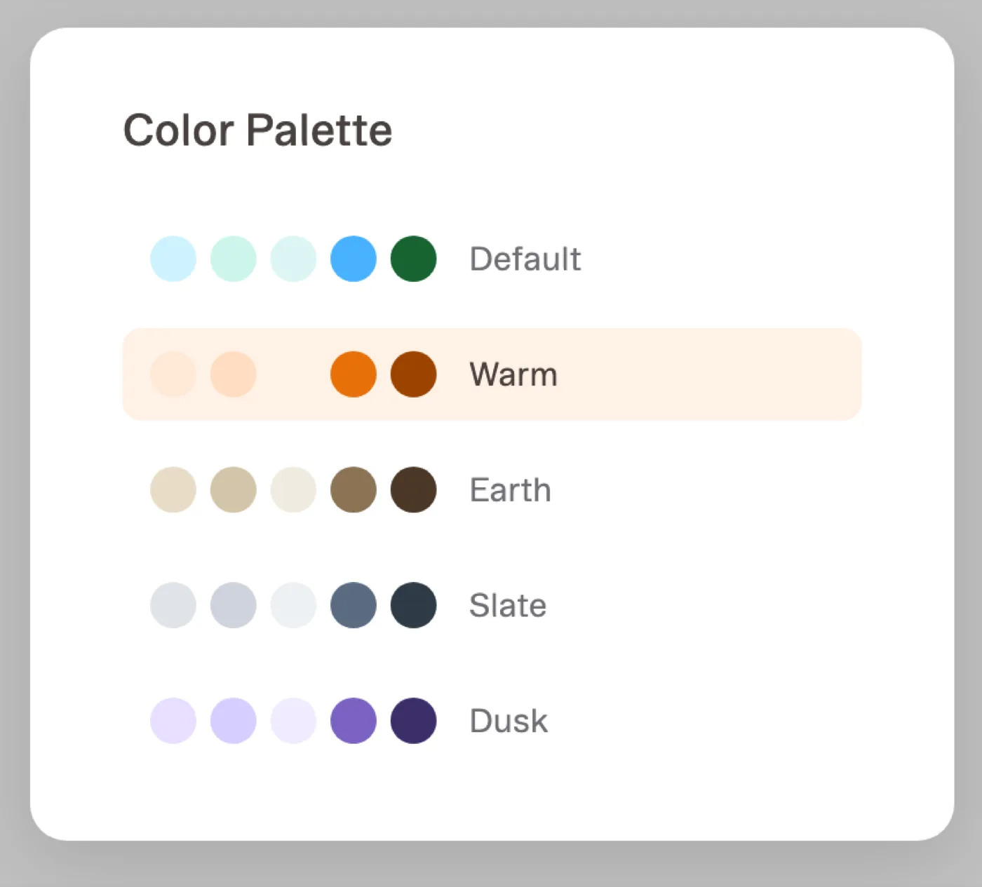 The palette control applies the selected theme through shared semantic values rather than component-specific overrides.
Product decisions become reusable components
A design system is useful only when it preserves decisions the product has already made. I therefore added a component after a real screen required it, not because it might become useful later.
Each reusable element followed the same path:
- Design nodeRecords the approved product decision.
- ComponentTurns that decision into a reusable implementation with defined properties.
- Storybook storiesDocument the content and states the component must support.
- Running productPlaces the component inside the workflow it was designed to serve.
Tokens constrain every stage by defining the values each design and component may use.
This sequence kept the library tied to the product. It also gave AI-generated implementation a boundary: generated code could vary documented properties, but it did not need to invent the underlying design decision.
Each reusable component therefore had both a source and a defined range of variation.
The engagement plan made sequencing visible
The same need for explicit decisions applied to planning the work itself.
The work had three phases, so the client needed to decide which product surface should come first, which should follow, and which should use the final phase. That order would determine what the team learned early and what later work could build upon.
I created a small shared application for making the choice. The client selected the first two surfaces, and the application saved the sequence on the server. Everyone who opened the plan then saw the same priorities and their consequences.
The selected sequence remains visible:
- Landing page
- Context engine
- Remaining surface
The planning application used 73 lines of Flask, one table, and persistent storage. Its technical scope was deliberately small because its purpose was narrow: turn a planning discussion into a shared, durable decision.
What the work produced
- a running operations product
- a published component library
- a documented path from design to implementation
- a shared tool for sequencing the work
These outputs show different levels of the same system. The product demonstrates how the workflows operate. Storybook shows how the components respond to variation. The token references define the values those components share.
Because all three are running and inspectable, the work can be evaluated beyond the screenshots in this case study. The team also had a system it could continue using afterward.
Notes
The product and component library are running software produced during this work.
The equipment, sites, people, jobs, and operational measurements in the public product are fictional. They exist to exercise the interface and its component states. They are not customer data or reported outcomes.
A second product surface contains the name of an end customer and data from a dealer network. Because that material has not been sanitized, it is not published.